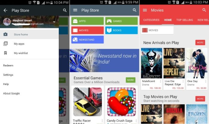
Android changed a lot of things in past couple of months and now it was the time to change the Google Play Store. Now the Google Play Store has been updated to the latest version which is v5.0.31. This time the changes that you will see on the Play Store is the material design touch and feel when you use the Google Play Store and experience it.
Google Play Store’s icon have also been changed and it looks more flat due to the material design of Android L. Talking about the user experience of the new Play Store, it is more colorful and looks proper flat and has many color palettes as the material design gives you the same feel. The Android L will be totally flat with material design and Google Play Store has started with highlights of material design. All the different tabs on the home of Play Store now show with different color assigned to different tab that you are in. The sections of categories also are highlighted with different colors like the Apps, Games, Movies, Books and gives us bright colors.
New animations are added on the Play Store which gives you a different feel and experience while you browse through. The ‘What’s New’ is now shifted to the top instead of bottom and the description for apps is now drawn down from the top. It’s been almost two months since the Google Play Store was updated and the all new Play Store with the material design will give you a different feel and experience. The updates for the Google Play Store will start rolling out once it will be ready and it might also be possible to face the delay as it will come for some regions and for some regions there will be a time slot.


